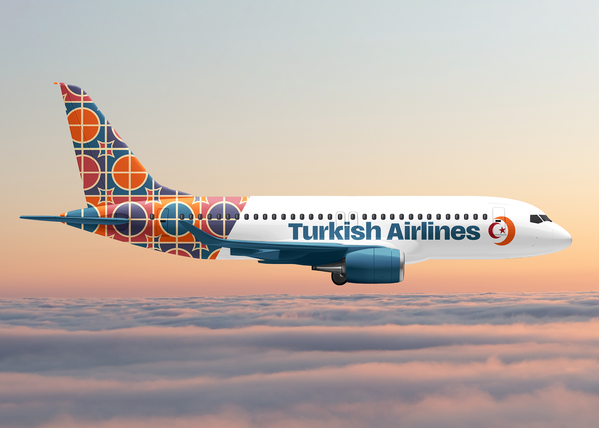

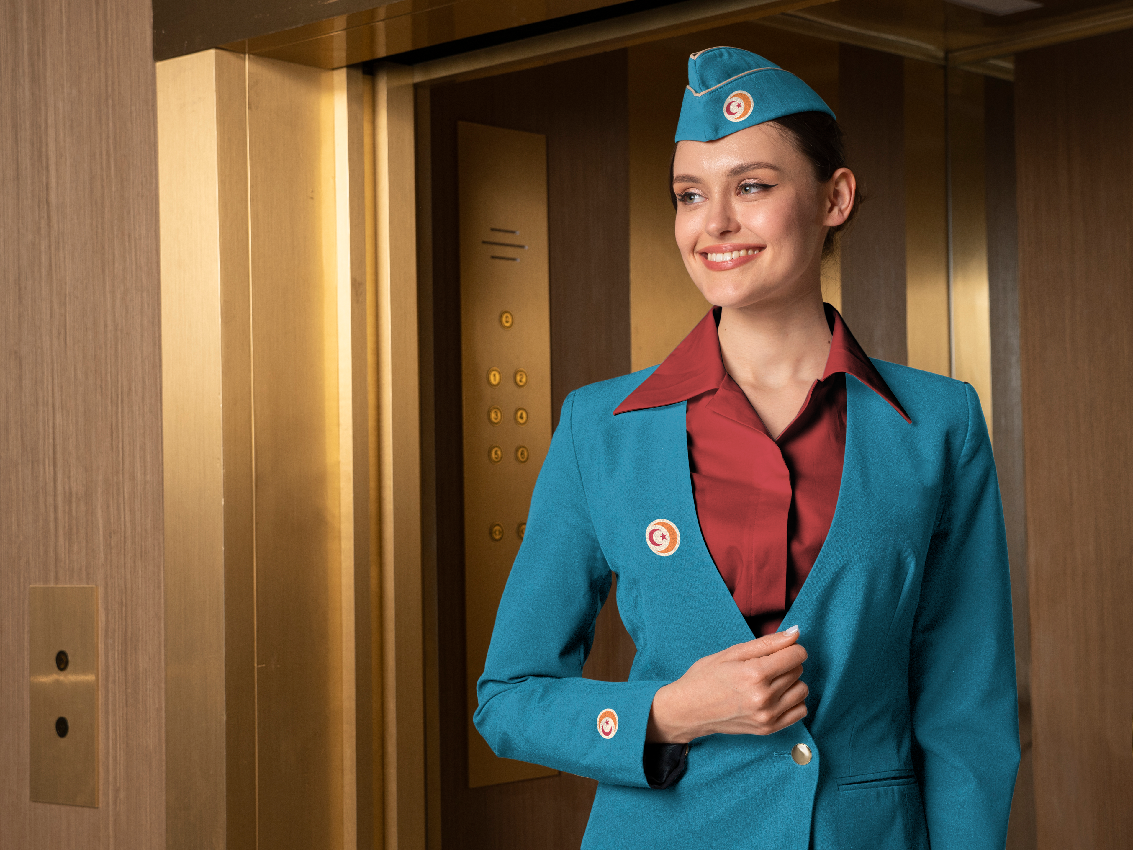
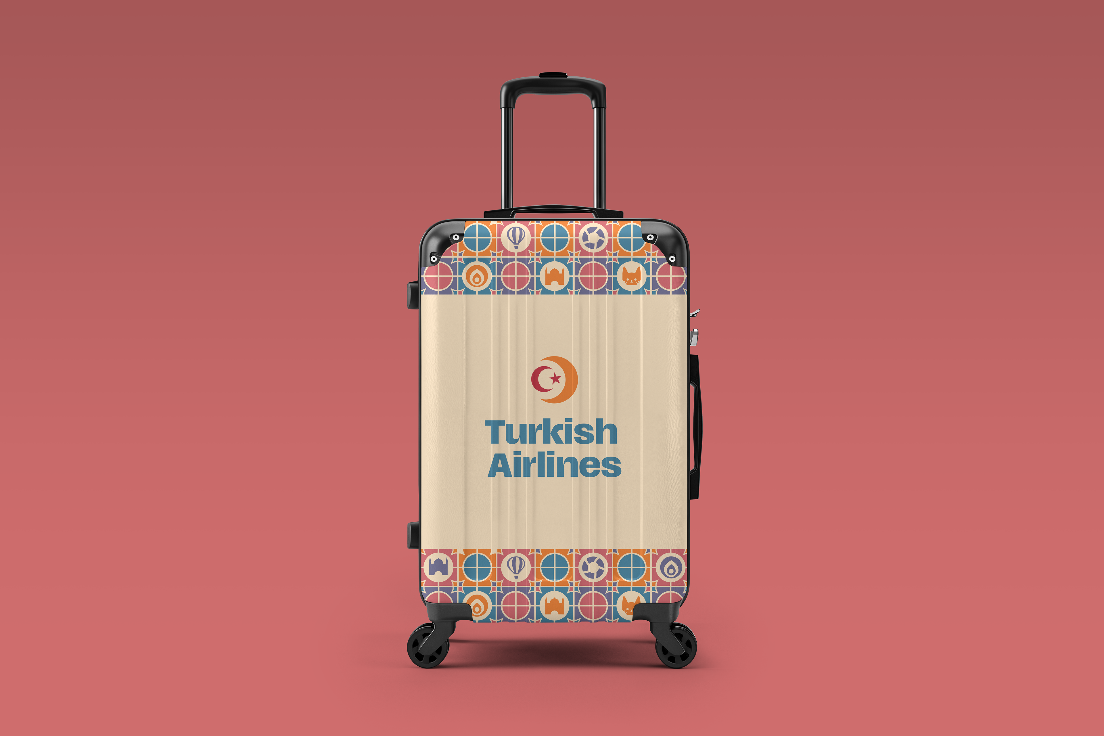
For this project, I rebranded Turkish Airlines with a visual identity that blends cultural heritage and modern travel comfort. Through extensive research into Turkish architecture, art, and everyday traditions, I drew inspiration from intricate tile patterns, historic mosques, and the warmth of Turkish hospitality, crafting a brand pattern that reflects trust, connection, and adventure. I incorporated meaningful symbols, including cats representing Istanbul’s charm, mosques for architectural beauty, Turkish tea as a symbol of hospitality, Simit (a beloved Turkish bread) for culinary culture, hot air balloons for exploration, and the evil eye for protection. The structured grid and geometric motifs create a sense of order and reliability, mirroring the airline’s premium service. The pattern and brand identity were applied across airport signage, amenity kits, suitcases, bag tags, and neck pillows, ensuring a cohesive, immersive experience that welcomes travelers with a distinct sense of Turkish culture. By integrating traditional elements into a contemporary design system, this rebrand reinforces Turkish Airlines as a gateway to cultural connection and unforgettable journeys.
For the logo, I drew inspiration from the Turkish flag, incorporating a red moon and star to represent Turkey. A larger gold crescent wraps around "Turkey," symbolizing the rest of the world connecting with Turkey through Turkish Airlines. The use of gold conveys prestige, hospitality, and global excellence, reinforcing the airline’s premium status. This concept directly ties into the fact that Turkish Airlines operates the world’s largest in-flight network, connecting more countries than any other airline. The branding reflects this global reach by emphasizing both cultural identity and international connectivity, positioning Turkish Airlines as a bridge between tradition and modernity, East and West.


Professor: Douglas May
Course: Advanced Campaigns Fall 2024
Course: Advanced Campaigns Fall 2024